Kiat's accomplishments in music have been well documented. As the head honcho of experimental audio-visual collective Syndicate, the godfather of Singapore's drum & bass scene, and a prominent producer on heralded labels like Metalheadz and Soul:R - he's (deservedly) been held up as one of tiny's country's greatest electronic music exports.
But beyond his exploits as an internationally-renowned DJ and beatsmith, Kiat is equally well-known in his day job as a visual artist. A veteran of the design and advertising industry, Kiat's celebrated work is just as prolific and boundary-pushing. Naturally, the multi-talented multimedia artist has also been combining his twin passions for many decades now.
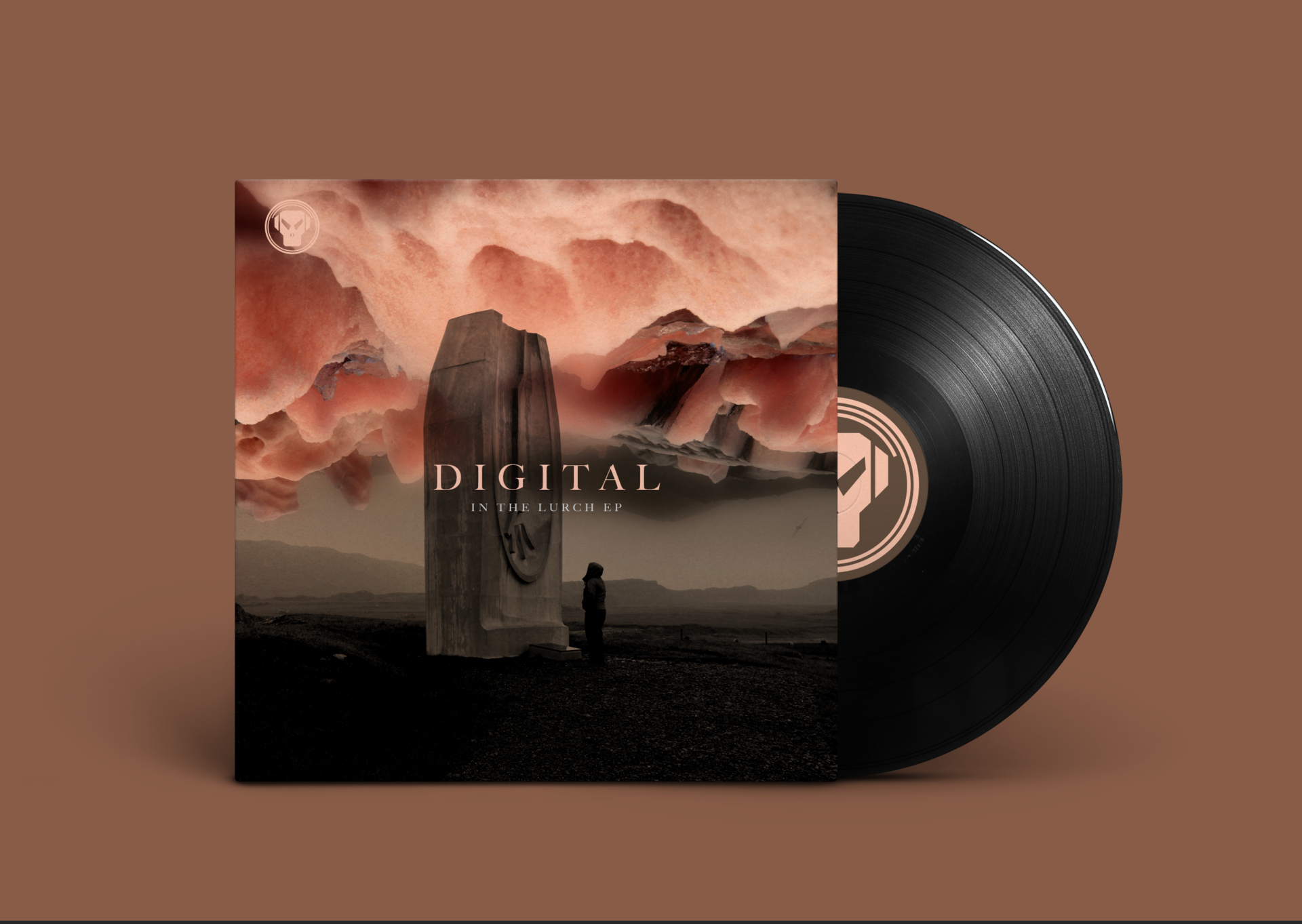
In the realm of music, Kiat has contributed sleeve art to several notable imprints around the world (including his own), and designed a multitude of collaterals ranging from posters to fliers. Most recently, he's been tasked by iconic Metalheadz founder Goldie and drum & bass legend Digital to craft the cover artwork for the latter's In The Lurch EP.
So for this edition of Under Covers, we figured it'd be an opportune time to have a chat with Kiat about his visual endeavours.

Artwork for Kiat's own Ataraxia EP.
Hi Kiat! Most fans mostly know for your music, but you’ve been a designer for a very long time as well. Could you tell us a bit about your background in the visual arts?
I’ve actually been into design throughout my life. Graduated from Lasalle and finished a degree in Multimedia Arts in Melbourne. After graduation, my first job was as an art director at a small design studio for about four and a half years called WORK which was started by Theseus Chan. From then on, I was in the design/advertising industry for too long! I’ve always been attracted to the visual arts in my childhood through multimedia cultures such as hip-hop.
What drives your passion as an artist and designer?
The desire to create and make stuff though different mediums. As well as a certain feeling that my work constantly isn't good enough for myself… that’s a lifelong struggle that has become my DNA somewhat. Or it could be just ADHD.

Artwork for Vandetta Remixes EP
Are there any visual artists that inspire you?
Marie Schuller, the Head of Fashion Film of Showstudio. I began working with Marie on scoring fashion film for brands such as Versus and Givenchy amongst others. I never thought that I would see my music on fashion projects and seeing it work in tandem gives me such a buzz!
Bart Hess from Material Artis as well. He creates latex mutants and human hybrids using new materials. Check out his short films Mutants and Heart To Mouth. He's definitely pushing his ideas constantly into unchartered territory. It’s like science fiction meets fashion in an interesting junction.
And finally, Theseus Chan of WORK. Besides his distinctive graphic style for WERK magazine, I was inspired by him at an early age where he used to constantly remind me to challenge myself to make my work different enough to be uncomfortable... which means that I’m onto something different and fresh. I think with art and design, the logic of the human mind can create work that seems ‘nice’, sterile and unemotional which I find rather forgettable. I’d much rather create from the heart in the purest way possible and hopefully it shows in the work.

When was the first time you realised that you dual interests in music and design could intertwine?
Not so much design in it’s purest sense but my early experiences listening to hip-hop DJs play while artists paint in the background did leave a strong impression on me from an early age. In my secondary school days, I think the experience of going record hunting with my seniors during lunch hours and digging through the record shelves played a role.
Looking at the artwork and wondering what the music sounded like was a large part of discovering how the two different disciplines are not that different, and can not only exist simultaneously, but also in a symbiotic way, where both actually benefit. When I started making music at a later stage, I found countless similarities in the creation process… just like how design or art leaves a physical mark on an object, music leaves a sonic mark on a canvas of time.
Could you tell our readers about some of your past design work in music?
Due to my relationship in the drum & bass scene, I’ve been fortunate enough to contribute sleeve art to many labels that I've always admired such as Soul:R, Function and Metalheadz. I think it’s a nice way to complete the circle by contributing to something that has always inspired me. Currently, I also do artwork for Defrostatica, a new label from Germany run by Booga whom I’ve known through music for over 12 years.
All these labels do give me complete freedom to create anything and it’s a good exercise to expand my mind to come up with something that is hopefully different and memorable. And of course, having the Syndicate label really allows me to have some fun and try out new directions which I normally wouldn’t for other labels.

How did you get to work on Digital’s new In The Lurch EP?
When the music for the EP was submitted, I had a chat with Digital and we decided to have a chat with Metalheadz to see if we could do something different for his release artwork wise. No disrespect to the other designers from the label but I felt that with Digital’s music, the artwork needed a slightly deeper and cinematic feel to reflect the music.
I basically had an idea in mind which I quickly developed and sent across. We got immediate feedback from the label manager and Goldie about how much they like it and nothing on the artwork was changed. Pretty stoked about it now as I wasn’t sure if my cover proposal wasn’t the right feel for the label!
How would you describe your approach and creative process for this album cover?
My approach for most music design usually starts with a good listen to the music while I’m having a look at random forms of inspiration such as art photography or abstract paintings. At some point, I will start to sketch out ideas in my mind that I feel could work. From there, I’ll do up a few options and I’ll let them sit for awhile before I revisit them again to see that resonates with me. Unfortunately, my method usually seems like madness on the surface but it works for me in a way I can’t quite pin down.
It’s just a feeling in the pit of my tummy when the elements are right. For this particular project, I went down a couple of wrong paths which seemed interesting in my mind but didn’t look right once I laid them down. At the very last minute, I was just scrolling through my photography archive and I chanced upon an image of Cherry standing in front of a monolithic sculpture in the middle of nowhere, somewhere in Iceland. And the image fit perfectly to the sound of the release.
What’s your favourite track on the album?
Frankly, I really do like them all! It would be hard to pick just one really as they work as a nice little EP. But if you put a gun to my head, I’d choose the title track ‘In The Lurch’ as the mood is classic Digital, moody and cinematic!
Lastly, what’s your favourite album artwork of all time?
I can’t decide! I think it’s between Miles Davis’ Bitches Brew and Massive Attack’s Blue Lines. Very different styles but both iconic in their own right!

With our new interview series entitled, Under Covers, Bandwagon aims to shed a bigger spotlight on the talented artists behind some of our favourite cover artwork of today and yesteryear.
Like what you read? Show our writer some love!
-

